We’ve updated the look of our brand
You may have noticed that we recently gave our brand a facelift. After a decade of encouraging our clients to push their expectations and dream bigger, we decided it was time to practice what we preach. Over the next few exciting months, we’ll be rolling out our new brand. First though, we'd like to tell you a little about it.

Why the change?
We’ve come a long way since Surface was founded in 2008.
As individuals and as a company, we’ve grown exponentially. We’ve learned a lot about what our values are and what we want to represent. Working closely with countless clients over the years we’ve had the invaluable opportunity to listen and learn. Finding out what’s most important to those we design for has allowed us to refine our focus and continually improve our product.
A lot of love went into our rebrand
As a company, we emphasize the importance of innovation, quality, value, choice and design. We’re already very well known for the high quality, high-value product we provide and we’ve received numerous awards that speak to our design acumen and calibre of construction.
The one thing that resonates most profoundly with our customers is offering them the ability to custom design their condo unit, from start to finish for free
Of all the valuable things we provide our clients in relation to both our product and our service, the one thing that resonates most profoundly with our customers is offering them the ability to custom design their condo unit, from start to finish, exactly how they want it, for free. Everybody is unique and everyone has their own dream of what their perfect space should look and feel like. So that unique, custom experience is what we wanted to express through our brand.
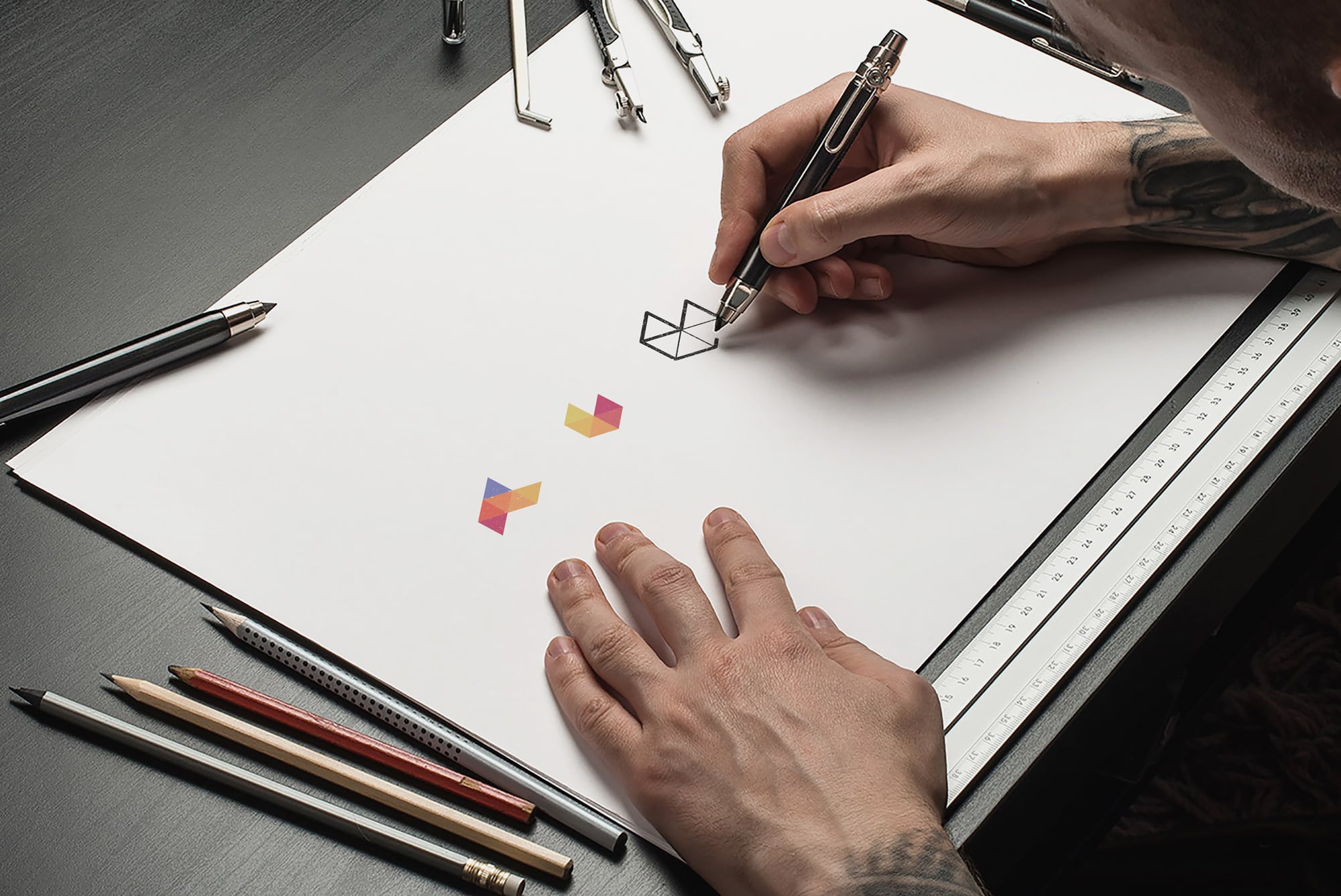
Our new logo is made up of a series of triangular facets that combine to create a partial hexagon. The shading on the triangles, however, creates the impression that this is actually a box. This trompe d’loeil effect gives what is essentially a flat shape a sense of three dimensionality and is evocative of the transformation that we facilitate with our clients each and every time we pick up a pen and help them to sketch out their dream homes. These drawings, ideas, conversations, and hopes, eventually turn into the real spaces as they transform from paper into our client’s homes.
The triangles and geometric shapes that combine to make our logo are also only one simple representation of what could be created with these objects. With those same shapes, we can manipulate, combine, expand, and craft an infinite number of unique, beautiful and completely different objects. Our logo is imbued with transformative potential and so is each and every unique home that we create.
Whether you’ve known us for a while or will be meeting us soon for the first time, we’ve grown a lot, but we’re still the same team working hard to push the boundaries and create the best residential spaces in Ottawa. We’re that same company that many have chosen to trust and support for all these years. We look forward to creating many more uniquely beautiful spaces for many more uniquely beautiful people, just like you.


